This is the first of the longer pieces I promised in the opening post of this series.
My phone has been set to greyscale for months now. It started as self-defense - the standard advice about making the slot machine in your pocket less rewarding - and I expected to last about a week. Instead I turn colour back on maybe once a fortnight, for a map or a photo I actually need to judge, and every single time I flinch. The thing is candy-bright. Loud in a way I had completely stopped registering. Then I switch it back off and the room gets quiet again.
The mental hygiene worked. What I did not expect was the second effect, which turned out to be the more interesting one, and which is really what this whole post is about: it changed what I could see.
Scroll a feed in greyscale and most of the images collapse. Not some of them - most. It becomes very obvious very fast how many photos you encounter in an ordinary day are running purely on signal colour: a saturated orange, a branded blue, a sunset cranked until it hums. Take the colour away and there is nothing underneath. No composition worth the name, no contrast doing any work, no reason for the eye to stop anywhere in particular. We have collectively agreed to use colour as an attention mechanism rather than a compositional one, and the result is a diet of pure sugar with no finesse in it anywhere.
And then every so often something does stop you, and it stops you harder than it ever did in colour, because now you are seeing structure instead of being flagged down. Those images are worth studying, because whatever is holding them up is doing so without the loudest tool in the box. Greyscale turns out to be a decent instrument for sharpening your own eye, which is not what I installed it for.
Try it for two weeks. Worst case you learn which pictures in your own archive were only ever carried by a colour.
Half-truths we repeat until they sound like physics
The greyscale thing is one small correction to a much larger problem, which is how much of what we believe about photography arrived without ever being examined. Somebody says it on YouTube, it gets repeated, and after a while it stops sounding like an opinion and starts sounding like a property of the world.
My favourite specimen, because it is the most confidently wrong: 50mm is the focal length that matches human vision.
I would love for some photography student somewhere to write a proper paper on how this claim managed to convince so many people, because as far as I can tell it is repeated far more often than it is examined. And the giveaway is that everybody agrees on the conclusion while nobody agrees on the reason. Ask five people why it is true and you get four different mechanisms, each of which falls apart when you poke it.
The most literal version goes via the focal length itself, which is easy to check and immediately wrong. The eye's physical focal length is somewhere around 17mm, and it is not even fixed - the lens in your head changes shape when you focus on something close. Whatever else 50 is, it is not that number.
So people move to field of view, which sounds much more promising. A 50mm lens on full frame covers roughly 40 degrees horizontally and about 27 vertically. Human vision runs to something like 135 degrees. That is not a near miss, that is a different order of thing. And this is where the comparison stops being merely inaccurate and starts being category confusion, because our eyes do not work like lenses at all. Only a tiny patch of the retina resolves sharply. If we assessed our vision the way we assess a lens, on the basis of what is actually sharp on the sensor, we would be walking around with a two degree field of view. We do not notice this because our eyes are in constant motion and the brain assembles the result into a stable picture that never existed on the retina in one piece. Which is a further reason the comparison fails: there is no exposure. You are not looking at a frame, you are looking at a composite being continuously rebuilt.
Point this out and the argument usually retreats to perspective. Never mind the angle, the claim goes, it is about how lines and depth relationships look - a 50mm rendering of a street matches how the street feels to stand in. Except the eye projects onto a curved surface and a lens projects onto a flat one. There is no focal length that makes a flat projection behave like a spherical one; the geometry simply does not have that solution. You can pick a focal length whose distortions bother you least, and that is a real thing worth choosing, but it is a preference about failure modes rather than a match. And whatever "how the street feels to stand in" means, a good part of it is coming from having two eyes about six centimetres apart, which no single lens has ever done anything about.
The last version is the only one with something in it, and it quietly gives the game away. A 50mm image can look right - but only if you also fix how far away the viewer is standing. Move a print closer to your face or further from it and you have changed the angle of your overall shot, which is roughly what zooming does. So the claim holds only if we all agree to look at pictures from the same distance, which we very obviously do not, since the same photograph now gets viewed on a phone at arm's length, on a laptop, and occasionally on a wall.
Notice also that the arguments pull in opposite directions. Match the total field of view and you end up somewhere around an ultra-wide. Match the small cone you are actually attending to at any given instant and you end up in short telephoto territory, 85mm or beyond. Match the projection geometry and there is no answer at all. Nothing here arrives at 50 unless you already knew that 50 was the answer you were looking for.
What is really going on has nothing to do with eyes. The diagonal of a 35mm frame is about 43mm, and a lens roughly matching the diagonal of its format was, in Barnack's day, the cheapest thing to build fast and well corrected. 50 was close enough, so 50 got made, in enormous numbers, for decades, and came bundled with every camera anybody bought. Two or three generations of photographers learned to see through it before they ever chose anything. The "normal" lens is normal because of manufacturing economics and the shape of a rectangle somebody standardised a hundred years ago.
Once you have caught one of these you start finding the rest, and they all have the same shape - a decision presented as a fact:
The good light is golden hour and blue hour. Grey skies are boring. A photograph has to be sharp and full of detail. A photograph comes in a certain format.
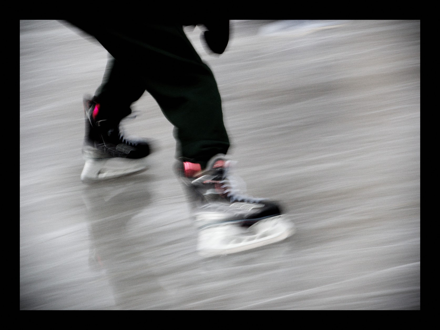
Take the sharpness one, since it cost me the longest to shake. Sharpness is the easiest quality to measure and therefore the one the industry has agreed to sell us, review by review, MTF chart by MTF chart. The longer I photograph, the less often I care. My favourite frame from last winter is a low-angle shot of a pair of black ice skates with pink laces cutting across the ice, and essentially nothing in it is sharp. The blur is the subject. Freeze that moment properly and you have a picture of some skates.
The frame is a decision, not a default
Which brings me to the last one on that list, and the one I have thought about most.
Image formats are a convention. Not a law, not a technical constraint, and not even a very old convention. There was a time when oval and round images were about as ordinary as rectangular ones - look at what people hung on walls before industrial production got involved. The rectangle won because it is what rolls off machines efficiently, what fits a film gate, what cuts from a sheet without waste. Then it won so thoroughly that everything else began to feel wrong.
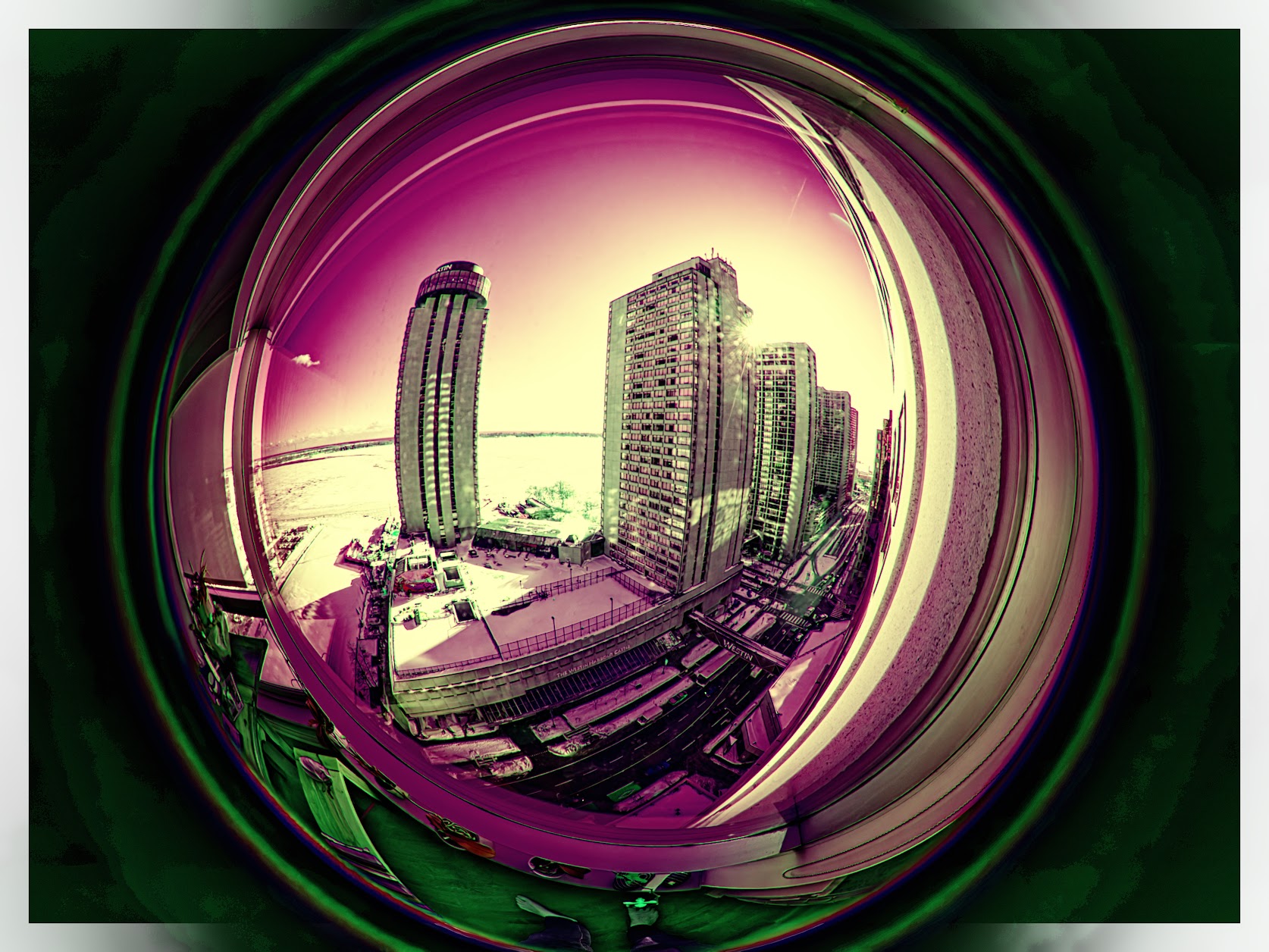
I have been playing with a circular fisheye lately, a lens that produces a genuinely round image with black around it, and the most interesting part has been watching my own reaction. Round pictures feel wrong to me. Not bad. Wrong, the way a misspelled word is wrong. I look at a round photograph of the Toronto skyline in magenta and green, sun flaring off a tower, the whole thing curled into something like a crystal ball, and part of my brain is still filing a complaint about the shape. There is no reason for that beyond a lifetime of rectangles. The complaint is information about me, not about the picture.
So here is what I actually think, and it is the closest thing I have to a rule. A mature photographer chooses the format from what they are trying to say, not from where the sensor collects the most data.
That turns a default into a set of questions worth asking every time. Do you want to confirm what the viewer expects, or surprise them? Where should the eye enter, and where should it be unable to leave? Are you after symmetry or motion? Do you follow the standard - landscapes horizontal, portraits vertical - because the subject wants it, or because that is what everyone does? A square imposes a calm that a 3:2 cannot, simply by refusing to favour any direction. A very long horizontal makes the eye travel and turns viewing into something closer to reading. Extreme formats are wonderful for exactly this reason: they make the viewer feel the shape before they have identified anything inside it.
None of that is available while the frame is still a setting you never touched.
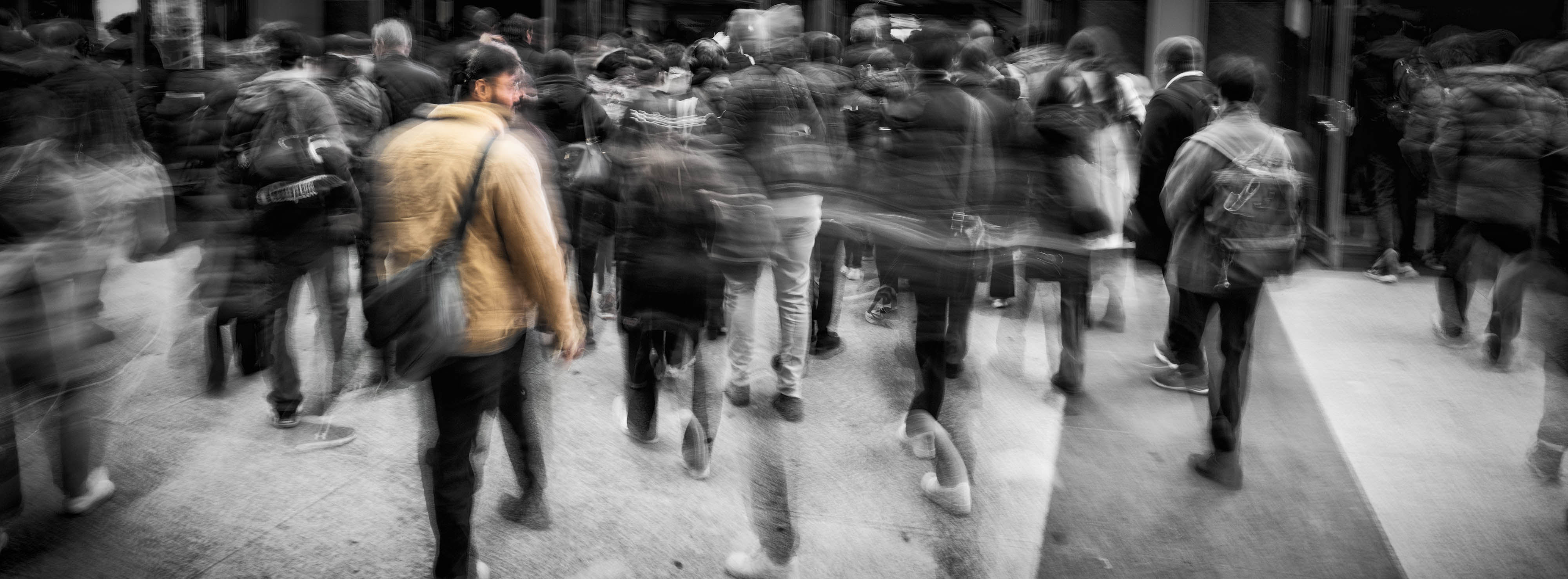
Minor White has a line that I keep coming back to, and it is one of my favourite photography quotes: "Don't show me what it is, show me what else it is!" I do not manage it often. But the times it works are the times I decided something on purpose - the colour, the light, the shape - instead of accepting what the camera and the internet handed me.
There is more where this came from. The whole series collects under Photo Thoughts.
Comments
Replies come from Mastodon. Reply on Mastodon to join in.